Ohhhh….Pantone what a dreamy colour you’ve chosen for 2019!
I must say I have a professional crush on Pantone. Sounds kinda creepy I know, but they have been the rock and foundation for so many things I have designed and developed over the years.
Also, [disclosure moment] I have a love affair with colour.
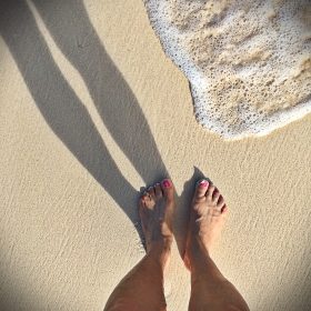
That’s actually humourous for those who know me. Though summertime wardrobe, table settings, and home decor colour pops are vibrant, come September and the cooler, longer days of fall and winter you will see me in endless black on black from a wardrobe perspective. Case in point I have dozens of bateau neck and turtle neck colours in black. The same could be said for the myriad of demin cuts…. in black.
For those of you who are unaware of Pantone they are as stated on their website:
“The Pantone Color Institute ™ is a consulting service within Pantone that forecasts
global color trends and advises companies on color in brand identity and product
development, for the application and integration of color as a strategic asset.”
An endless source of inspiration and resource for anyone with a love of or career in design and development.
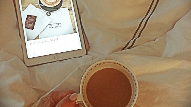
Now…about this colour.

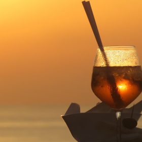
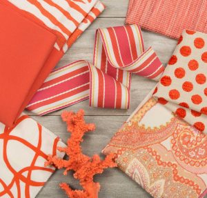
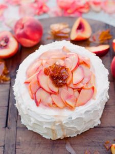
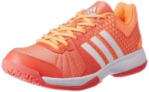
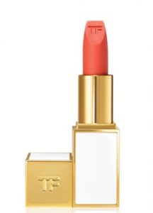
It is such a happy, glorious choice as their colour of the year. It can be used so beautifully across apparel, home design and food…what’s not to love?
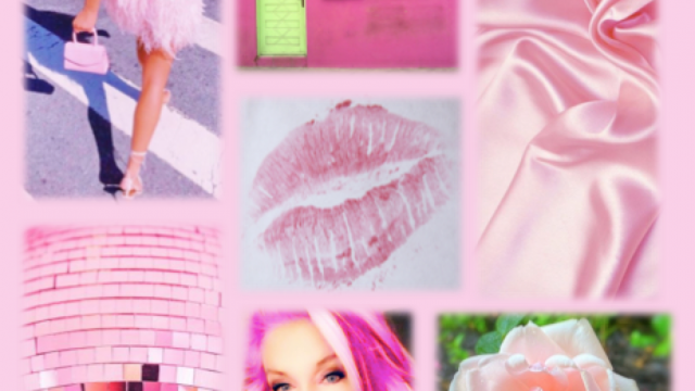
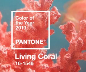
Living Coral Pantone colour 16-1546 as the colour for 2019. I simply love the fresh, bright optimism of this colour choice. It makes my heart sing.
So let’s talk colour psychology because though I love neautrals from a wardrobe perspective, the design element in decor, design and fashion is a love affair with colour. Coral: from the Orange family. But what does that mean?
Orange is a combination of red and yellow. Yes, we all learned this in elementary school…but think about it. Red is filled with energy and stimulation, and yellow is responsible for the happiness and cheerfulness. This is why I love this active colour; it blends a whole lot of goodness.
It’s invigorating and full of energy in your home and on you!
It has a glorious sense of optimism and rejuvenation.

It actually is rather fun and playful and you can infuse into your everyday life.
Also, this is a colour that inspires us to be active. There is a sense of competition, activity and element of risk….at least a little.

This is also a colour that gives you comfort and shelter in those tough moments. It’s an uplifting positive and rejuvenating colour, and you truly need to bring a pop of it into your life however and whenever.
I simply love the energy and positive vibe of this colour…..2019 : bring it on !
xo- Sandra
Credits:
Credit references & photocredits to :
- pantone
- Kravet
- Tom Ford
- Adidas
- Weddingomania
- Delvecove spices